100 Strong Productions Logo Relaunch
By NCACC Communications and 100 Strong Productions Teams
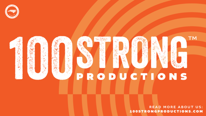
100 Strong Productions Rebrand
As we celebrate its third year, the NCACC’s 100 Strong Productions logo might look different, but its focus remains the same — sharing the stories of 100 counties for the betterment of one state — one vision, one team, #100Strong.
At the start of 2024, the 100 Strong Productions team decided it was time for a cleaner look and a more established brand style. While interested in creating something bold and distinct, the team wanted a new logo and a new brand style that hinted at the first version of the 100 Strong logo. With an intent to create memorability, the new logo uses the original bright orange, explores texture with font, and molds text into a rectangular shape. The team was also interested in seeing graphics representing the energy and success of the production company.
With the completion of two award-winning documentaries (Resilience: Food For All and The Veteran’s Battlefield) and several short video series (e.g., County Lines, an eight episode video series showing the responsibilities, processes, and hard-working people that make county governments operate in North Carolina), the new logo affirms the production company’s dedication in support of the NCACC’s mission to capture a visual representation of the untold stories that impact North Carolina’s 100 counties.
For an in-depth account of how 100 Strong began and the community impact of its two documentaries, please read the feature article in the Winter 2024 issue of CountyQuarterly. The new brand identity will be rolled out across 100 Strong’s website, marketing materials, and social media channels.
To learn more about 100 Strong Productions, visit 100strongproductions.com.